Colour combinations that make amigurumi read well
Value contrast beats hue every time — plus the three-colour rule and why beige is doing more work than you think.
Value, not hue
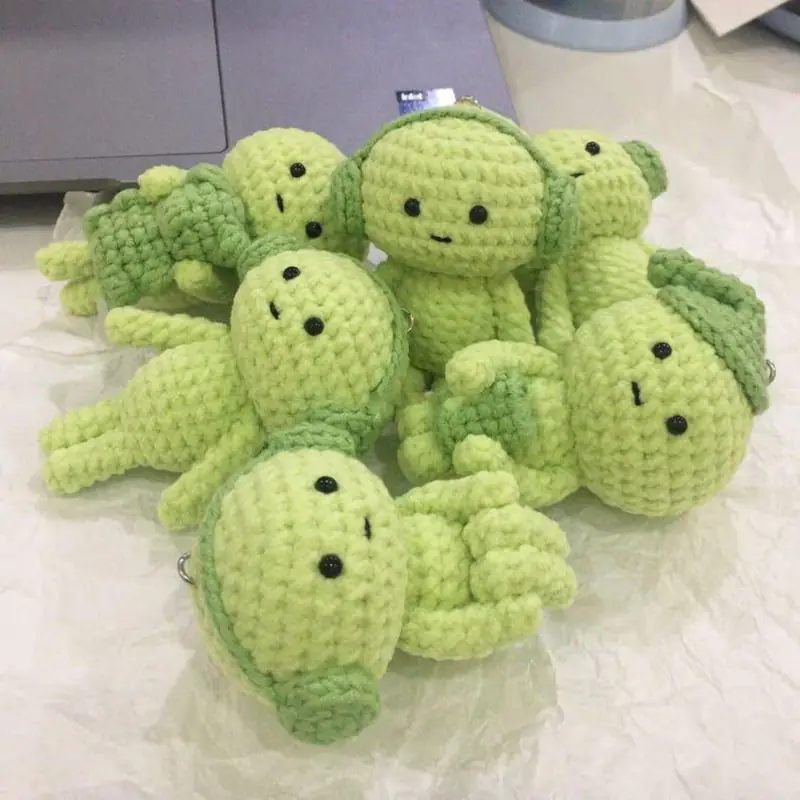
Two colours can be completely different hues and still muddle together if they are the same lightness. Photograph your yarn choices in black and white: if the shades vanish into one grey, the finished piece will look flat no matter how pretty the colours are.
Three colours, one job each
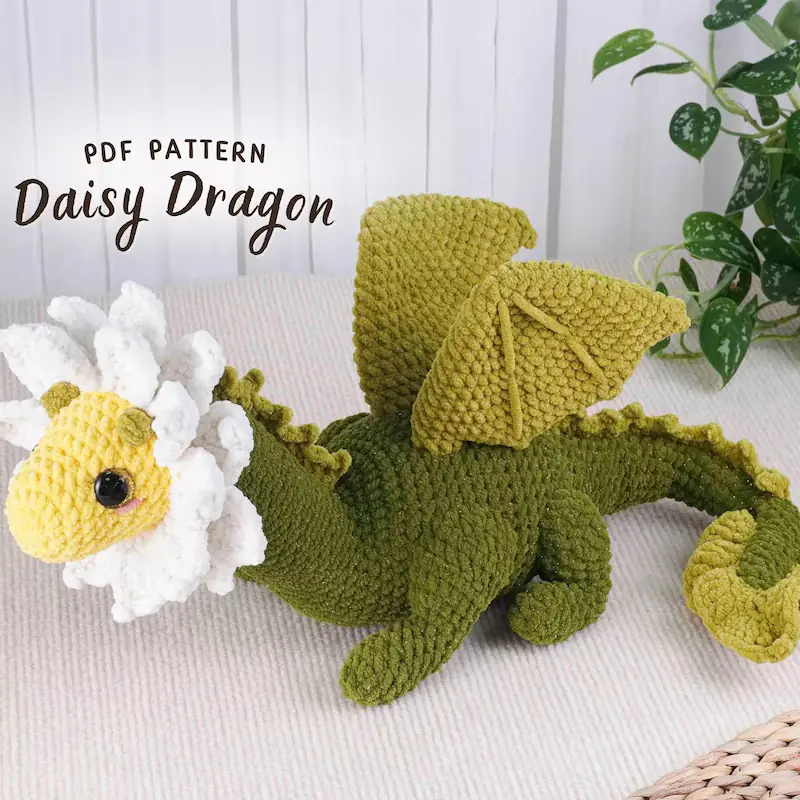
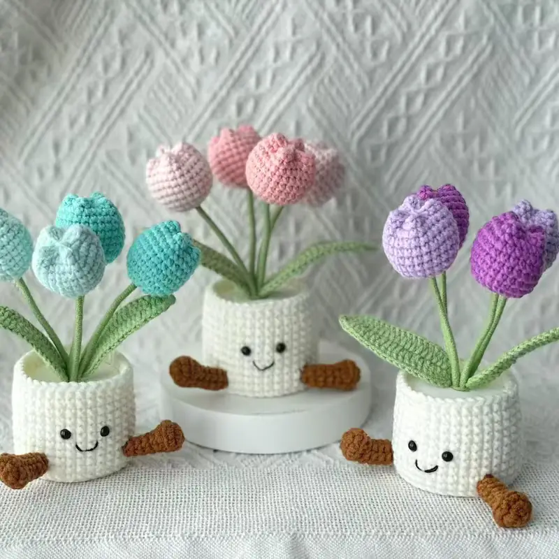
A dominant body colour, a secondary for limbs or clothing, and a small accent for details. Adding a fourth rarely improves a toy and usually makes it look busy at the small scale amigurumi works at.
Neutrals are structural
Cream, beige and soft grey give the eye somewhere to rest and make a saturated accent look deliberate rather than loud. Most pieces that "look off" have too much saturation and no neutral.
Test at arm's length
Amigurumi is seen from across a room more often than from ten centimetres. Hold your yarn combination at arm's length and squint. If the details disappear, raise the contrast before you start.